A user-centered focus is one of the key merits of the design thinking approach to problem-solving. Empathizing, the first of the 5-design thinking phases, allows you to deeply understand your users’ thoughts, feelings, needs, and behaviours. When you apply these user-researched insights during the design process, your products/services will address the real needs of the people they were made for. Empathy plays a crucial role in ensuring that your product or service is successful and sustainable.
So how can you identify and empathize with your users? And how can you maintain this understanding while also translating it into a user-centric mindset?
Personas
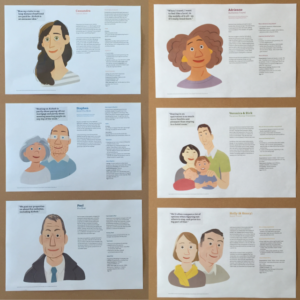
Personas, fictional characters that represent your users, are one of the most invaluable design thinking empathy tools. A persona’s most essential attributes are behaviour, motivation, goals, challenges, values, fears, and expectations. These vital characteristics allow you to build an empathetic lens through which you can see through your users’ eyes.
Though empathizing is an inherent part of human nature, it can sometimes be challenging to a) dismiss your own worldviews and prejudices and b) step into the shoes of a large and diverse body of end-users. Having multiple personas who embody distinct subgroups of your client base gives you clearly defined individuals to consider: What does Persona A truly want? How would Persona B feel if we made this change? Does our product deliver to Persona C’s expectations and challenges while also soothing their fears?
Personas in IT & Tech Environments
Throughout the vast areas and applications of technology, one common goal emerges: to improve the way people live. In its absolute dependence on being user-centered, empathizing with end-users – and therefore using personas – is indispensable to technological design.
In this essay, Alan Cooper, a software designer widely recognized as the “Father of Visual Basic” and the originator of personas, describes his long journey to develop these powerful empathy tools. While working with pioneers in business intelligence software, he says that the effectiveness of the first fully fleshed personas as design tools for him and communication tools for the entire construction team was obvious and significant. Personas became their secret interaction design weapon.
By dismissing the use of personas and simply designing with logic, a product or service becomes what Cooper calls “the sum of all desired features,” which is only “marginally successful at best.” Personas act as a road map of goals to facilitate, motivations to tap into, expectations to meet, and pain points to relieve and avoid. Personas are crucial to designing with a clear focus – a user-driven focus.
Pain Points
Pain points, areas of frustration or confusion for users, are an especially important part of a persona’s profile. Knowing what challenges your users face gives you a good indication of how exactly to help them and what elements to avoid. The fewer “ow-moments” a user feels, the better the design.
When it comes to tech products/services, common user pain points can be that they:
- Are unintuitive and challenging to use
- Don’t help users accomplish their goals or don’t solve the right problem for users
- Don’t provide necessary support or resources to users
However, there can even be pain points within your organization, such as communication challenges between teams, a lack of understanding between management and employees, unrealistic time or resource constraints, or inadequate onboarding processes.
Having significant pain points in both your user and employee experience can dramatically decrease the effectiveness and success of both. Design thinking can help your organization address those “ow-moments” and turn them into “WOW-moments.”
Airbnb: A Design Thinking Example of Empathy in Tech

Source: https://huiyichia.com/2014/11/15/a-visit-to-airbnb.html
For Airbnb, the billion-dollar online lodging platform, empathizing with users played a major role in their rags to riches origin story. In 2009, a year after launching their website, the startup’s revenue had flatlined at $200 per week. It was only after using their website themselves that they realized the issue: the photos sucked for many of the listings offered. Grainy pictures from camera phones or images borrowed from classified sites prevented potential customers from actually seeing what they would be paying for. On a spur-of-the-moment decision, the team rented a camera and upgraded the low-quality pictures with beautiful high-resolution ones. A week later, the results were in: their revenue had doubled to $400.
This experience served as a building block for one of Airbnb’s core design principles: becoming the user is the best way to create better products. While software and computers are powerful, code alone can’t solve every problem that customers have. Meeting and empathizing with users is always the best way to understand your users’ problems better and develop creative solutions.
Today, Airbnb keeps posters of user personas and user journey maps (or storyboards, as they call them) on the walls of their office as a reminder of who they’re designing their products for.


IT roles tend to get comfortable as “keyboard jockeys” and their job descriptions don’t always indicate that they need to keep users in mind. Think you need to learn how to design with empathy like Airbnb? Read our blog posts on designing based on understanding and other empathetic design tools.
Be sure to check out the upcoming design thinking training sessions that we offer or contact training@spring2innovation.com for more information.
